
If the past year has taught us anything, it's that breathing new life—and cozy charm—into the home can be a game changer. Among the best ways to bring instant character and color to a room? The perfect wallpaper. “You can take a bare-bone space without any sort of classical beauty and transform it,” says Vanessa Barneby, co-founder of Barneby Gates, the British wallpaper company that melds painterly English touches and rich color schemes with a modern, sustainable approach.
Searches for wallpaper have spiked during lockdown, says Barneby, who has seen an uptick in interest for her brand's geometric papers and nature-inspired designs, like its graphic Honey Bee and cheerful Capri Lemon motifs, or a new wildflower paper collaboration with florist Willow Crossley. In the spirit of upping your design game this season, she shares her tips for choosing the best wallpaper for your home. Plus, how to be sure it's sustainably sourced, safe for you, and easy on the planet.
Start with a Favorite Chair, Cushion or Rug
“If a customer doesn’t know where to begin with wallpaper, I advise starting with a cushion, rug or chair that they absolutely love, and building out from there,” says Barneby of letting the space itself lead in selecting a wallpaper. Such objects can offer visual clues about the color, shape, and scale of pattern that appeals to your eye and provide an intuitive jumping off point. A favorite olive green couch with teal piping, for example, could lead to the choice of wallpaper with teal as the dominant color. “I love a room that looks like it’s come together organically over time as opposed to totally interior designed by one person in one shot,” says Barneby of favoring "layers and textures, a mix of old and new.”
Consider the Room, Commit to Your Vision
Before choosing a wallpaper, Barneby reflects on the room itself. “I prefer to wallpaper all the bedrooms and bathrooms in a home, as well as the study, to create these lovely little jewel boxes of pattern and color,” she says, adding that she leaves the main hallways and living spaces of her London home bare to create balance. If maximizing a feeling of space is key, on the other hand, she suggests strategically picking a print that creates the illusion of it. Stripes, for example, can “stretch out” a narrow room when applied horizontally. Barneby also likes to add a dado rail and wallpaper above it to “split the room and create height.” In nearly any space, Barneby prefers to paper all four walls, and occasionally even the ceiling. "[Focusing on just one feature wall] can set a room off balance or create too much of a focal point,” she explains. “I’m constantly encouraging people to cover the whole room rather than dipping a toe in.”
Embrace the Natural Light of Your Space
North, East, South or West-facing rooms will each have a different effect on the tone of a wallpaper based on the amount of natural light they allow into a room. “North-facing rooms will bring out cooler tones, and South-facing rooms are warmer,” says Barneby, who suggests working with what you’ve got. "Wallpaper has the ability to make even a cold, stark room look cozy and inviting." She prefers to lean into the cooler light with a dark wallpaper, such as a deep burgundy red, to evoke a “cocoon-like space" or choosing one with subtle metallic accents. "A dark room can look fabulous with wallpaper that has a hint of gold." Whichever wallpaper you select, she adds, mirrors can do wonders in bouncing the light and "lifting the feeling of a room," as can a neutral white bulb, which best approximates natural light.
Ask Yourself This: Is Your Wallpaper a Backdrop or Centerpiece?
Whether you go for a large-scale or small-scale pattern “depends on what you want to say,” says Barneby. A good place to start is: Think about what you’re going to be putting on the walls. “If you've got a bold, modern art collection, you may want something simpler in the background,” explains Barneby. If your goal is a print that's "a piece of art in itself," you won't want to cover it. Generally, downsized prints and trellis patterns are easier to meld into the background and build upon with layers of texture such as wall hangings, lighting, and statement furniture.
Check for Eco-Friendly Certifications To Protect the Planet
To reduce environmental impact, most eco-minded brands are committed to working with sustainably managed forests that reduce environmental impact. Barneby suggests looking for a wallpaper that is FSC- or PEFC-certified, which means that the source of the paper products have been harvested responsibly. As a general rule, water-based inks tend to be lower in VOCs (volatile organic compounds) such as formaldehyde and toluene, as are papers that are PVC-free. And remember, the perfect wallpaper is one "that you put up and leave up,” says Barneby. Like a favorite piece of jewelry or photograph, the best prints acquire happy memories—a baby's homecoming, a legendary party—and meaningful associations with the passing years.
Test Drive a Wallpaper Before You Press Go
Settling on a wallpaper print can feel like a no-turning-back kind of decision. Phone apps like Primer make it possible to preview samples at full-scale using photos of your space. But nothing is as effective as bringing a potential winner into your home for a proper test drive. “Get a massive cutting, hang it in the room, and let it sit there for a while,” advises Barneby. Pay close attention to the light conditions and how it harmonizes with the rest of your interior. If you're still in love with it after a month, you're ready to commit.

Barneby Gates Capri Lemons Wallpaper

Manuel Canovas Cote d'Azur Wallpaper

de Gournay x Erdem Wallpaper

Gucci Heron Print Wallpaper

Stevie Howell Jewels Fern Avocado Wallpaper

Maison C Eden Wallpaper

Graham & Brown Tropique Zoo Wild Wallpaper

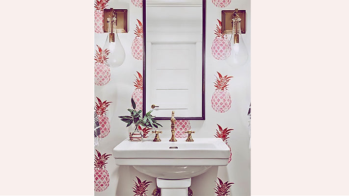
Barneby Gates Pineapple Wallpaper
Plus, discover Vanessa Barneby's top three clean beauty staples, from a wildcrafted Welsh face serum to the highlight stick that lights her up.
Shop our favorite wallpaper prints from Barneby Gates and beyond here.


